


La première refonte de l’identité visuelle de PepsiCo depuis vingt-cinq ans marque un tournant stratégique décisif qui fait du design un moteur de croissance. Le nouveau “ p ” minuscule, la palette de couleurs organiques et le slogan “ Food. Drinks. Smiles. ” expriment clairement l’ambition de l’entreprise d’harmoniser son portefeuille mondial tout en faisant de la durabilité et de l’empathie des leviers concurrentiels.¹ Cette initiative reflète la conviction du conseil d’administration selon laquelle le design est désormais un moteur de performance commerciale, car il façonne la perception, accélère l’innovation et relie la raison d’être de l’entreprise à l’expérience client.
Une conception stratégique pour une « Maison mondiale » unifiée
Un symbole d'entreprise conçu pour créer du lien
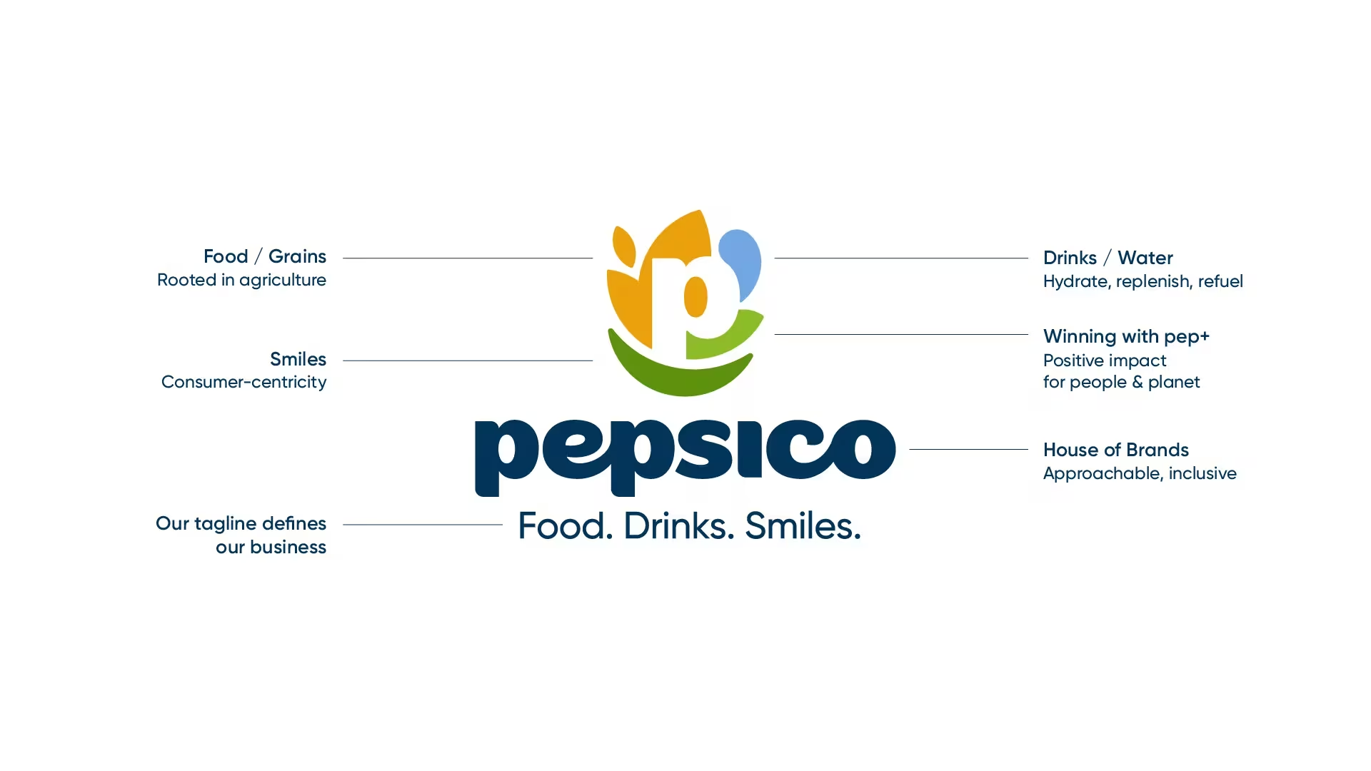
La lettre “ p ” minuscule constitue le cœur visuel de la nouvelle identité de PepsiCo. Son rythme circulaire symbolise l’unité, tandis que sa géométrie douce évoque la convivialité.² Le logo intègre des éléments représentant le grain, l’eau et la feuille — symbolisant respectivement l’alimentation, les boissons et le développement durable — afin d’exprimer les trois piliers opérationnels de l’entreprise.³ Cette structure permet à l’un des plus vastes portefeuilles de marques au monde de communiquer à travers un langage unique et cohérent. Résultat : les consommateurs reconnaissent une maison mère commune à l’ensemble des produits, ce qui renforce la confiance et la visibilité sur des marchés de plus en plus fragmentés.
Transformer la connaissance des consommateurs en alignement stratégique de l'entreprise
Une étude menée par PepsiCo a révélé que seuls environ 21 % des consommateurs étaient capables d’identifier une autre marque que Pepsi.⁴ Ce constat a été le catalyseur du changement. En repositionnant l’identité de la maison mère comme un élément fédérateur plutôt que comme une simple toile de fond, PepsiCo redonne de la visibilité à l’ensemble de son écosystème. Cette approche montre comment le design d’entreprise peut résoudre un problème commercial – l’invisibilité de la marque – en recadrant la perception. Résultat : un transfert de capital de marque plus fort de la maison mère vers les sous-marques, ce qui renforce leur notoriété et leur différenciation.
Transposer le patrimoine dans un langage moderne et fluide
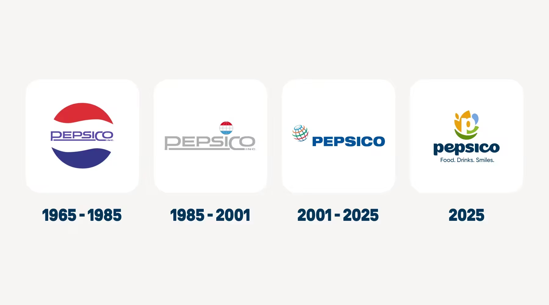
Les designers ont revisité la simplicité affirmée du logo des années 1980 et l’ont modernisé pour s’adapter à l’agilité numérique.⁵ Un contraste marqué, des contours adaptés au mouvement et une palette dynamique garantissent une bonne visibilité sur les écrans et les emballages, quelle que soit leur taille. Mauro Porcini, directeur de la création, explique que cette identité “ incarne notre héritage tout en exprimant notre optimisme pour les décennies à venir ”.⁶ Cette déclaration résume l’intention : transformer la familiarité en élan, en associant nostalgie et innovation afin que la marque apparaisse à la fois comme bien établie et prête pour l’avenir.
Mettre en place un système de conception pour l'ère de la connectivité
Une identité adaptative qui évolue en fonction de la vitesse
Cette refonte de l'identité visuelle introduit un cadre modulaire conçu pour offrir flexibilité et rapidité.⁷ Chaque élément — statique ou animé — peut être redimensionné sans perte d'intégrité, ce qui permet une adaptation plus rapide sur toutes les plateformes. Pourquoi est-ce important ? L'agilité est devenue un indicateur de croissance. En intégrant la réactivité dans l'ADN de sa conception, PepsiCo s'assure que son image de marque évolue au rythme des modes d'interaction des consommateurs. Conséquence : les équipes marketing et commerciales déploient désormais le contenu plus efficacement, ce qui raccourcit les cycles de production et améliore la cohérence à l’échelle mondiale.
Une gouvernance fondée sur la précision et la créativité
Pour coordonner des centaines d’agences et 200 marchés, PepsiCo a mis en place une bibliothèque centralisée de ressources numériques ainsi qu’un guide de référence.⁸ Ce système de gouvernance laisse aux équipes locales la latitude nécessaire pour adapter les éléments visuels dans le respect de paramètres définis. Cet équilibre entre autonomie et supervision est la marque de fabrique d’une gestion de marque aboutie. Comment cela fonctionne-t-il ? Les ressources de la marque sont modulaires, ce qui permet une localisation rapide tout en préservant la fidélité visuelle. En quoi cela est-il important ? La gouvernance devient alors un levier de croissance, garantissant que la liberté créative renforce la performance plutôt que de nuire à la cohérence.
La clarté, un atout opérationnel
Cette nouvelle approche visuelle réduit le bruit et concentre l'attention sur l'essentiel : la reconnaissance. En regroupant plusieurs codes graphiques au sein d'une architecture simplifiée, PepsiCo gagne en efficacité et renforce son impact.⁹ Des tests menés en Amérique du Nord ont montré une meilleure visibilité en rayon et une meilleure mémorisation des ensembles d’emballages unifiés.⁶ Cette clarté se traduit par des gains mesurables : une association plus rapide par le consommateur, une réduction des redondances créatives et un meilleur retour sur investissement des ressources graphiques.
Intégrer les valeurs humaines dans la culture d'entreprise
Du producteur au créateur d'expériences
Le slogan “ Food. Drinks. Smiles. ” redéfinit PepsiCo, qui passe du statut de fabricant à celui de créateur de moments humains.¹⁰ Ce message met en avant une entreprise qui accorde autant d’importance au lien émotionnel qu’à l’excellence opérationnelle. Pourquoi : les consommateurs privilégiant les marques qui reflètent leurs valeurs, le bonheur et la responsabilité constituent un langage commun. Comment : en associant ses produits à des expériences universelles de plaisir et d’attention, PepsiCo suscite un écho auprès de toutes les catégories démographiques. Et alors : la marque d’entreprise devient une narratrice de modes de vie, et non plus seulement un symbole d’appartenance.
Le design, reflet du leadership
Le leadership s'exprime à travers le comportement, et le design en est l'expression la plus visible. La nouvelle identité incarne l'empathie grâce à des formes accessibles et à des transitions de couleurs douces. Mauro Porcini décrit souvent le design comme “ l'expression visible de la culture d'une entreprise ”.¹¹ Dans ce cadre, l’identité renouvelée fait office de symbole culturel, incarnant l’ouverture, l’inclusion et une vision commune. Conclusion : chaque élément visuel renforce désormais les comportements en interne, transformant ainsi l’esthétique en un outil de gestion.
Gérer le sens au sein d'un écosystème complexe
La richesse symbolique offre des opportunités, mais exige également une certaine maîtrise. Les observateurs du secteur soulignent que lorsque plusieurs concepts — patrimoine, joie, nature — coexistent, la cohérence doit prévaloir.¹² PepsiCo préserve sa cohérence en n’activant que les codes pertinents pour chaque campagne. Pourquoi : une narration rigoureuse évite la surcharge conceptuelle. Et alors : le système de marque reste lisible, ce qui préserve son capital à long terme tout en offrant une flexibilité narrative propice à l’innovation et aux partenariats.
Construire des marques qui traversent le temps
Une marque forte perdure parce qu’elle transcende les générations. Le rebranding comporte toujours le risque d’éloigner les publics plus âgés tout en recherchant une nouvelle pertinence. Pourtant, les consommateurs évoluent sans cesse et s’approprient de nouveaux codes visuels ; le changement devient donc essentiel pour rester dans l’air du temps. Tout l’art réside dans l’équilibre entre continuité et renouveau. Un changement trop radical peut briser l’héritage : le sort de l’identité visuelle trop futuriste de Jaguar nous rappelle ce qui se passe lorsque l’évolution se transforme en rupture.
Les meilleures refontes d’image de marque, à l’instar de celle de PepsiCo, créent des ponts culturels plutôt que des ruptures stylistiques. Elles répondent aux attentes modernes sans effacer la mémoire. À l’ère de l’intelligence artificielle et du branding algorithmique, l’authenticité fait la différence. Le design fondé sur les données peut prédire les tendances, mais seule l’intuition humaine préserve l’âme. Chez Kainjoo, le principe est clair : une marque doit s’inscrire dans le cadre d’une écosystème d'expériences, là où les symboles, les interactions et les valeurs se fondent pour former quelque chose de durable. La couleur et la typographie constituent la surface ; le sens en est la substance.
La leçon stratégique à tirer de la transformation de PepsiCo est simple mais profonde : à l’ère de l’accélération, l’intemporalité reste l’avantage concurrentiel le plus rare. La pertinence attire l’attention, mais c’est la continuité qui inspire la confiance — et la confiance est la valeur ultime des marques qui perdurent.
Références
- “ PepsiCo dévoile une nouvelle identité de marque audacieuse ”, Salle de presse de PepsiCo, le 28 octobre 2025. https://www.pepsico.com/newsroom/stories/2025/pepsico-introduces-a-bold-new-corporate-brand-identity
- “ Le premier nouveau logo de PepsiCo depuis 25 ans marque son passage à un modèle de ‘ marque ombrelle ’ ”, Adweek, octobre 2025. https://www.adweek.com/brand-marketing/pepsicos-first-new-logo-in-25-years-marks-its-shift-to-a-branded-house
- “ PepsiCo remanie son image de marque pour élargir son champ d'action au-delà de Pepsi ”, Plongée marketing, le 29 octobre 2025. https://www.marketingdive.com/news/pepsico-overhauls-corporate-branding-broaden-focus-beyond-pepsi/804080/
- Ibid., rubrique « Analyse des comportements des consommateurs ».
- “ PepsiCo vient de dévoiler son premier nouveau logo depuis près de 30 ans ”, Fast Company, le 11 mars 2025. https://www.fastcompany.com/91432245/pepsico-rebrand-health-food
- “ La refonte de l'image de marque de PepsiCo reflète son évolution stratégique ”, Alimentation et boissons - Numérique, le 30 octobre 2025. https://fooddigital.com/news/how-pepsicos-branding-change-represents-the-ceos-vision
- “ Le premier changement d'identité visuelle de PepsiCo depuis 25 ans marque le passage à une stratégie de ‘ marque ombrelle ’ ”, Storyboard18, le 28 octobre 2025. https://www.storyboard18.com/brand-marketing/pepsico-unveils-new-corporate-identity-as-it-accelerates-push-for-growth-and-transformation-83301.htm
- “ PepsiCo fait bouger les lignes avec sa première refonte d'image de marque depuis 25 ans ”, FoodBev Media, le 29 octobre 2025. https://www.foodbev.com/news/pepsico-shakes-things-up-with-first-corporate-rebrand-in-25-years
- “ PepsiCo dévoile une nouvelle image de marque après 25 ans sans changement ”, IPMARK, le 29 octobre 2025. https://ipmark.com/pepsico-rebranding-identidad-corporativa-2025/
- “ PepsiCo se renouvelle après 25 ans : une transformation mondiale ”, Brandsynario, le 31 octobre 2025. https://www.brandsynario.com/pepsico-rebrands-after-25-years/
- “ Comment la nouvelle identité de marque de PepsiCo pourrait-elle stimuler la croissance ? ”, Industrie numérique, 2 novembre 2025. https://www.manufacturingdigital.com/news/how-pepsicos-branding-change-represents-the-ceos-vision
- “ PepsiCo dévoile une nouvelle image de marque après 25 ans sans changement ”, IPMARK, le 29 octobre 2025. https://ipmark.com/pepsico-rebranding-identidad-corporativa-2025/